
Project Scope

The stroke weights, sizing, and spacing of icons vary noticeably. Additionally, grid layouts inconsistently mix 3- and 4-column structures within the same grid, without a clear rationale or design justification.
Creates lack of cohesion making the design more optically straining. layout.
Lack of information hierarchy and logical grouping of information. Difficult to intuitively navigate and find the feature you’re looking for.
Lack of breathing space with lots of unrelated items bunched together. Visually overwhelming, poor reading experience.
User Personas

James is 29 and lives in London. He is a busy professional who juggles long hours with an active social life and passion for physical fitness. He is a confident gym user and prefers to get in the zone, complete his workouts alone then head straight home. He doesn’t take group classes but sometimes books additional services such as swimming or use of the sauna.
- Frustrated by cluttered interfaces that make it difficult to access core features quickly.
- Values a streamlined experience, especially when short on time.
- Complete workouts efficiently and maximise gym time.
- Easily book extra services that fit into his busy schedule.
- Simple and intuitive navigation.
- Quick access to essential features.
- Easy booking and scheduling for additional services.

Emma is outgoing and sociable but lacks gym experience. She wants to build her confidence in a supportive environment while improving her overall fitness. She’s interested in attending classes and possibly trying personal training but isn’t sure where to start.
- Feels overwhelmed by the number of options at the gym.
- Struggles to know where to start without clear guidance.
- Learn how to improve her physical fitness.
- Build confidence through instructor-led classes and staff support.
- Discover and make use of additional gym services.
- Clear and logical navigation for easy feature discovery.
- Simple class booking and access to support resources.
- Helpful information on gym services and activities.
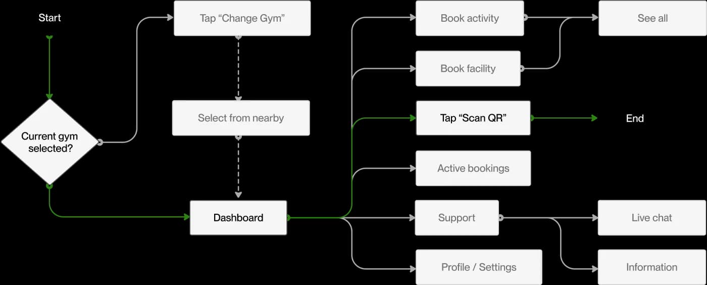
03.2 User Flow Digram
Brand Green
HEXy #061E07
RGB (6, 30, 7)
HSL (122, 67%, 7%)
Brand Green
HEXy #161F16
RGB (22, 31, 22)
HSL (120, 17%, 10%)
Brand Green
HEXy #555F55
RGB (85, 95, 85)
HSL (120, 6%, 35%)
Brand Green
HEXy #008328
RGB (0, 131, 40)
HSL (138, 100%, 26%)
Brand Green
HEXy #40A24B
RGB (64, 162, 75)
HSL (127, 43%, 44%)
Near White
HEXy #080808
RGB (8, 8, 8)
HSL (0, 0%, 3%)
Near White
HEXy #757575
RGB (117, 117, 117)
HSL (0, 0%, 46%)
Near White
HEXy #C6C6C6
RGB (198, 198, 198)
HSL (0, 0%, 78%)
Near White
HEXy #E6E6E6
RGB (230, 230, 230)
HSL (0, 0%, 90%)
Near White
HEXy #F1F3F0
RGB (241, 243, 240)
HSL (100, 11%, 95%)

The typographic system was designed for clarity, consistency, and readability. I used Inter as the primary font due to its modern and highly legible design.
To maintain visual harmony and reduce unnecessary variation, I limited the number of font sizes and weights, ensuring a clean and structured text hierarchy that enhances usability.

To create a visually consistent and well-structured layout, I implemented a 4pt spacing system, where all spacing and padding values follow multiples of 4.
This approach ensures a balanced and predictable rhythm across the interface, improving alignment and overall readability while maintaining a cohesive design language.
Final Screen Mockups


